Building a Health Tech App from Scratch
Leading brand, product strategy, and UX to bring a new health tech product to life. From first sketch to real-world launch.
ROLE
Lead Product Designer | End-to-End Ownership
TEAM
Founder, Co-founder, Hardware Engineer, AI/ML Engineer
DELIVERABLES
Brand Identity, UX/UI, Design System, Prototypes, Hardware-UI Alignment
TIMELINE
Nov 2024 to Sep 2025 (MVP in 4 months)
Designing a New Way to Track Personal Health
Pondo is a data-driven consumer platform (AI-powered) that turns overlooked daily habits into real-time health insights. As Lead Product Designer, I built this 0-to-1 health-tech product from concept to early funding. I designed UX for an AI-powered diagnostics platform integrating hardware sensors, real-time data processing, and mobile interfaces. I defined the brand, shaped the experience, and built a scalable design system from scratch.
This case study walks through how we turned a complex health concept into a clear, premium experience that users could trust.
Digestive Health Issues Affect Billions, and Early Signs Often Go Unnoticed
Many early symptoms appear in bathroom data. Most people never notice them. Pondo set out to change that by building a device that transforms overlooked moments into personalized, actionable health insights.
My mission: design the first MVP of the Pondo app. I joined a fast-moving team building one of the first AI platforms for preventive health tracking. With basic screens in place to verify hardware, UX hadn't been touched yet. I had the opportunity to shape the product from the ground up.
Understanding the Mindset Behind Early Health Adopters
Who would spend $400 on a device that scans bathroom moments? That was the first big question. Pondo was built for proactive, data-driven users. People who invest in their health, seek innovation early, and expect premium experiences.
They're not casual fitness app users. They want early insights, scientific credibility, and products that feel as advanced as the technology behind them.
Pondo needed to feel intelligent, precise, and trustworthy. More like a health diagnostics platform than a consumer wellness app.
Setting the Foundation for a Premium Health-Tech Experience
From the start, it was clear. Pondo couldn't just feel like another wellness app. It had to feel like a precision health tool. Trusted. Modern.
These three pillars guided everything. The colors, the typography, the interactions.
Trust without complexity
Show the science, but keep it approachable
Simplicity and clarity
Make health insights feel easy, not intimidating
Modernity and confidence
Build something users are proud to own
Building the Experience Layer by Layer
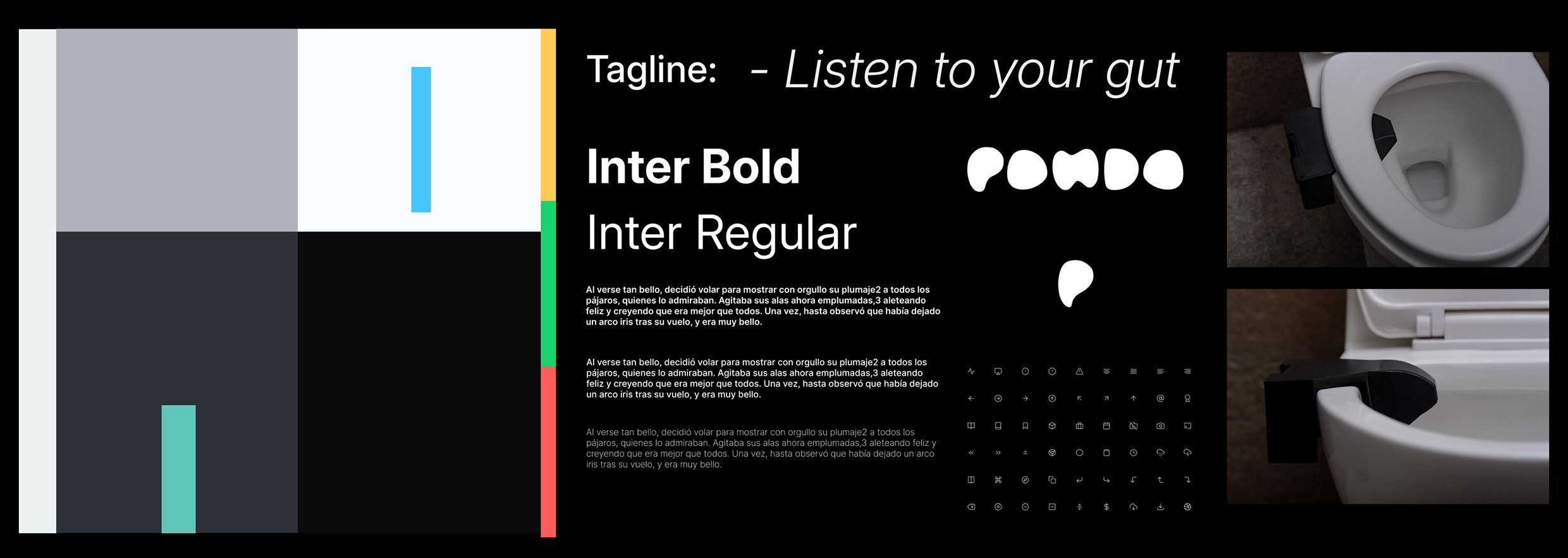
01 Style Guide
To shape Pondo's visual identity, I focused on clarity, calm, and trust. Muted neutrals bring space and simplicity, while soft aqua and blue add freshness. Typography: Inter. Icons: linear, minimal, expressive. Result: minimal, but memorable.
02 Sketches
Before locking in structure, I sketched out different layout and interaction ideas to explore options quickly and freely. These rough drawings helped me move fast, think through key flows, and spot what needed testing early on.
03 Wireframes
After validating the core concepts, I translated them into mid-fidelity wireframes to define the app's structure, core actions, and hierarchy. These wireframes helped shape the flow and ensure every screen made sense before diving into final UI design.
04 Sitemap
Before UI, I mapped the app's structure to align the team and set a clear foundation. This helped us spot gaps, prioritize features, and build a system that could scale with ease.
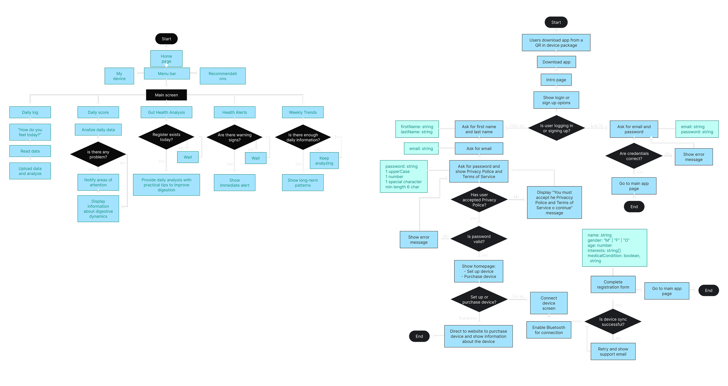
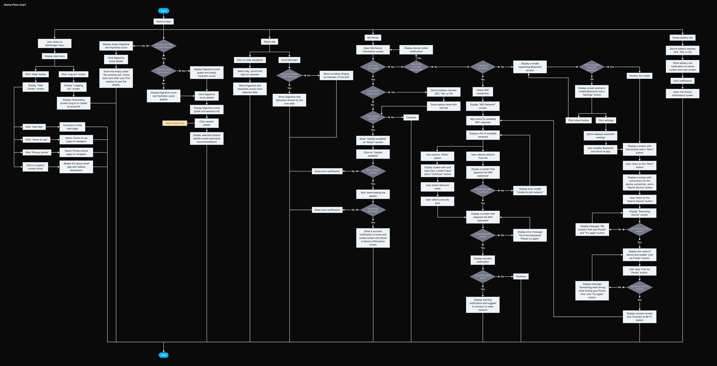
05 User Flows
I mapped key user flows to guide core experiences: onboarding, device sync, home (daily scores), and My Pondo (account and settings). These flows kept the team aligned, surfaced friction early, and helped us scale without adding complexity.
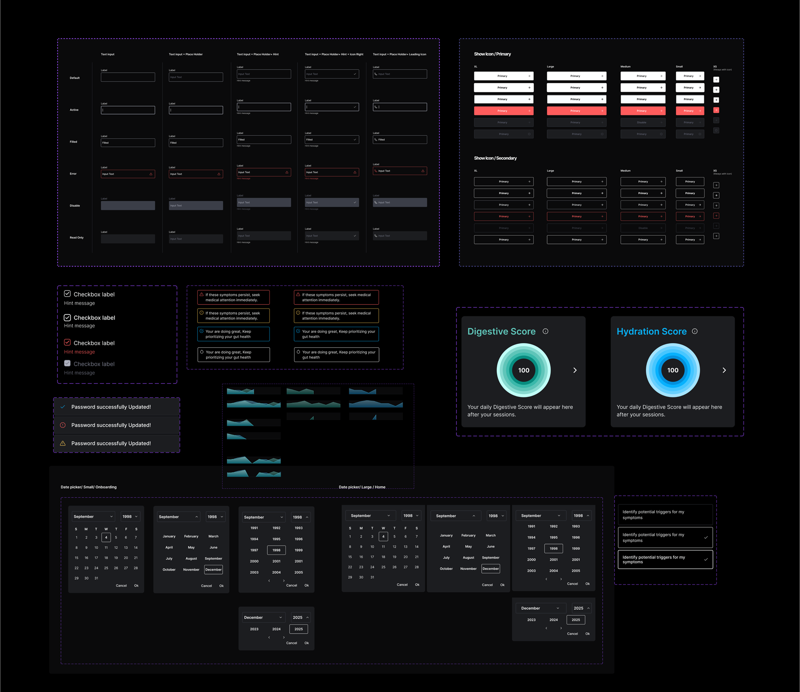
06 Design System
I built Pondo's design system using atomic design principles, starting with foundations like dimensions, grids, paddings, colors, and typography. Then came components: buttons, cards, inputs, and patterns used across both the app and device. The result: faster design, smoother handoff, and a flexible system built to scale.
Bringing It All Together
For our MVP launch, we focused on the flows that mattered most:
Onboarding
A simple, friendly flow to get started fast
Sync My Device
A guided setup to pair and confirm successful sync
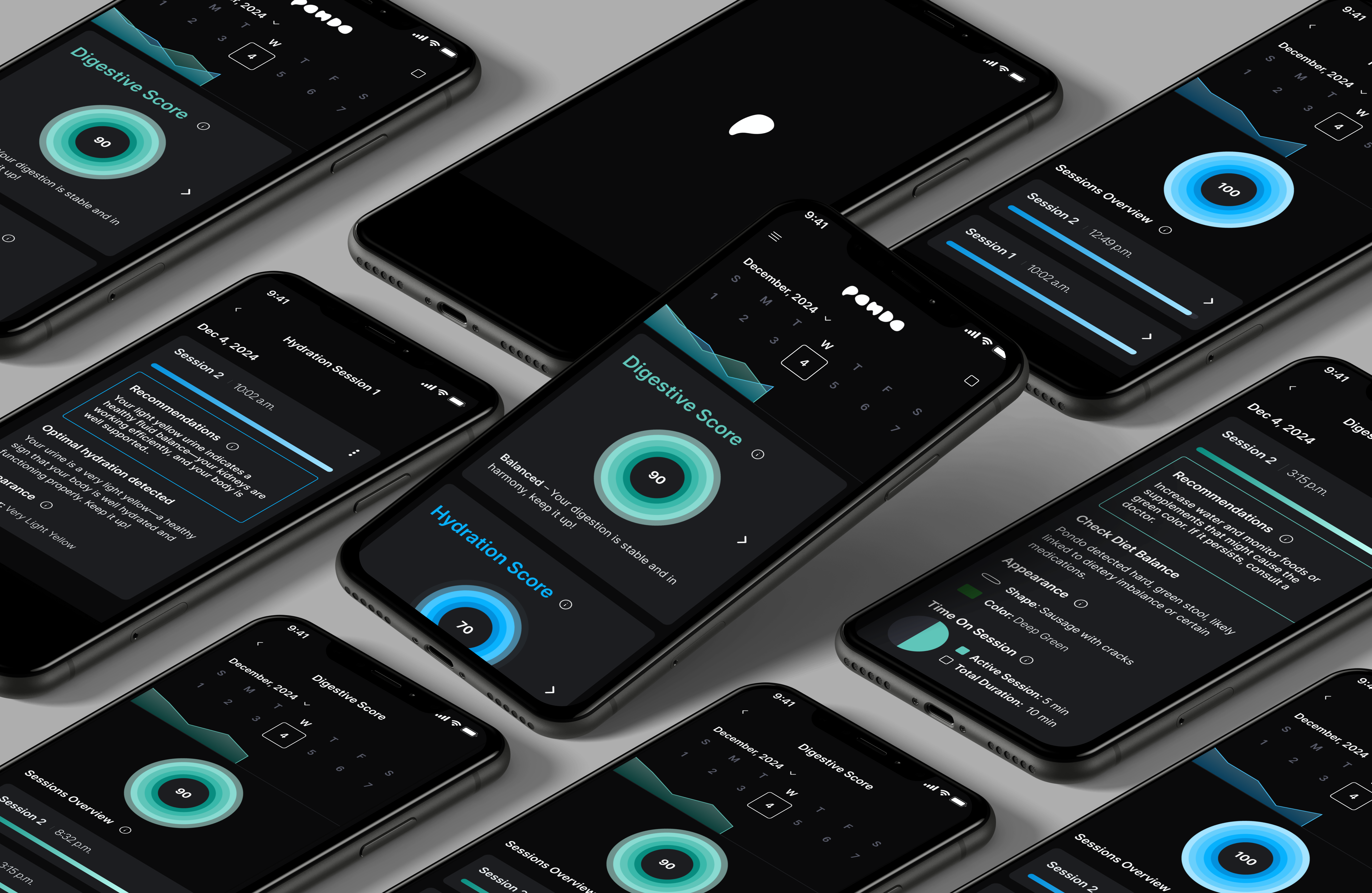
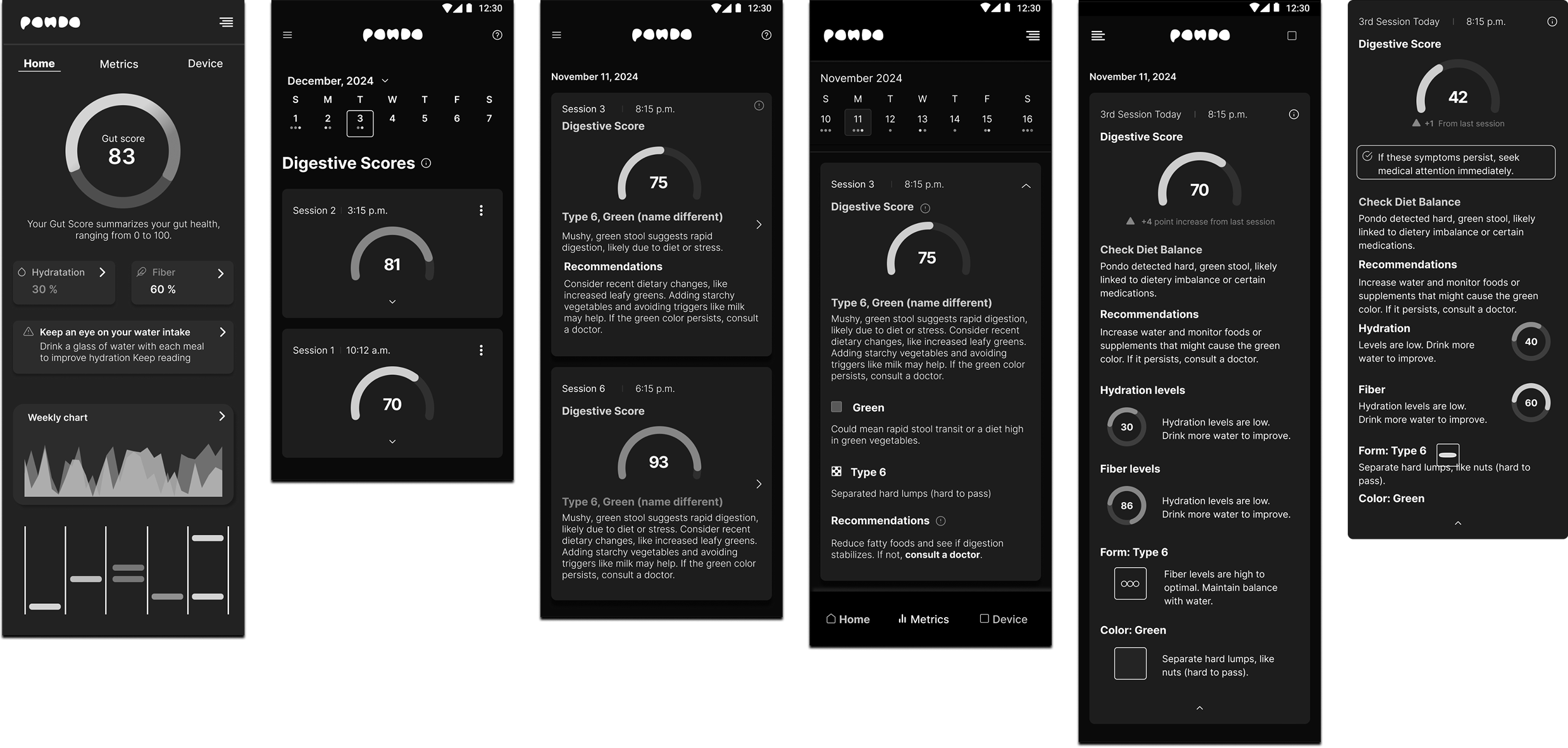
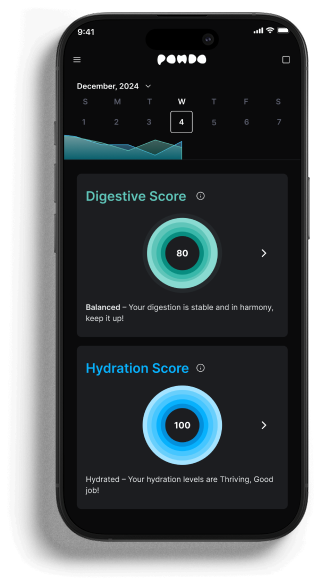
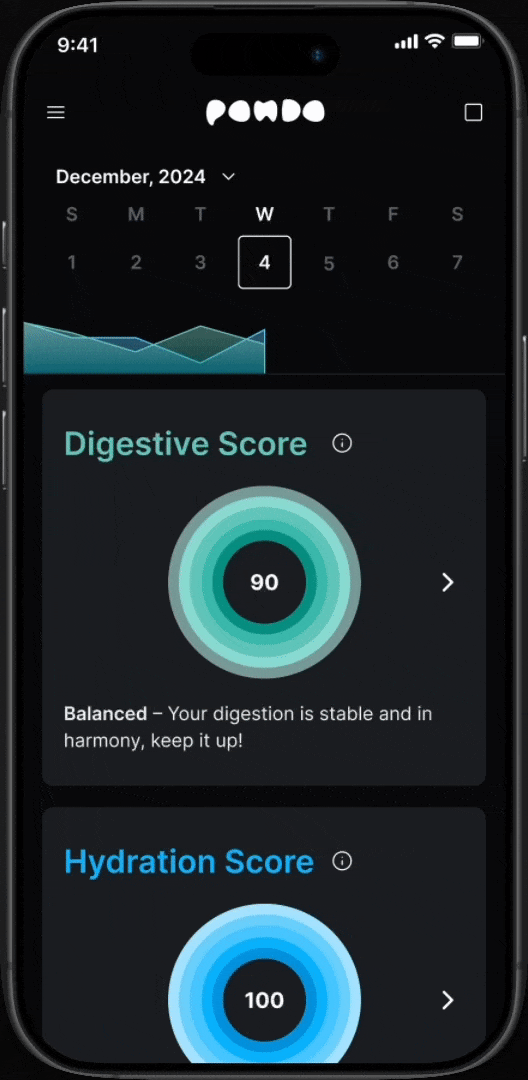
Pondo Home
Where users see their health scores, daily breakdowns, and evolving insights
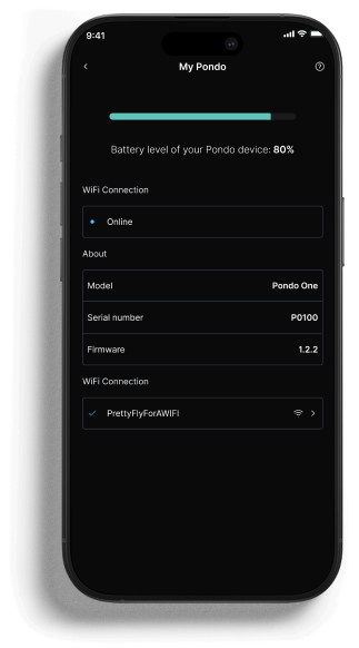
My Pondo
A settings hub for managing the device
Connection Lost
A fallback experience to help users recover quickly
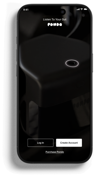
Onboarding in action
The final onboarding flow running on a real device.
Home experience
Daily scores, breakdowns, and health insights at a glance.
We Are All Prototypes
This MVP was built with speed and intention. The goal was to get a working product into real hands fast, then iterate based on actual user feedback rather than assumptions.
There's no perfect version. Only continuous improvement.