albo

Turning Lending Into Our Main Revenue, Part 1: Onboarding

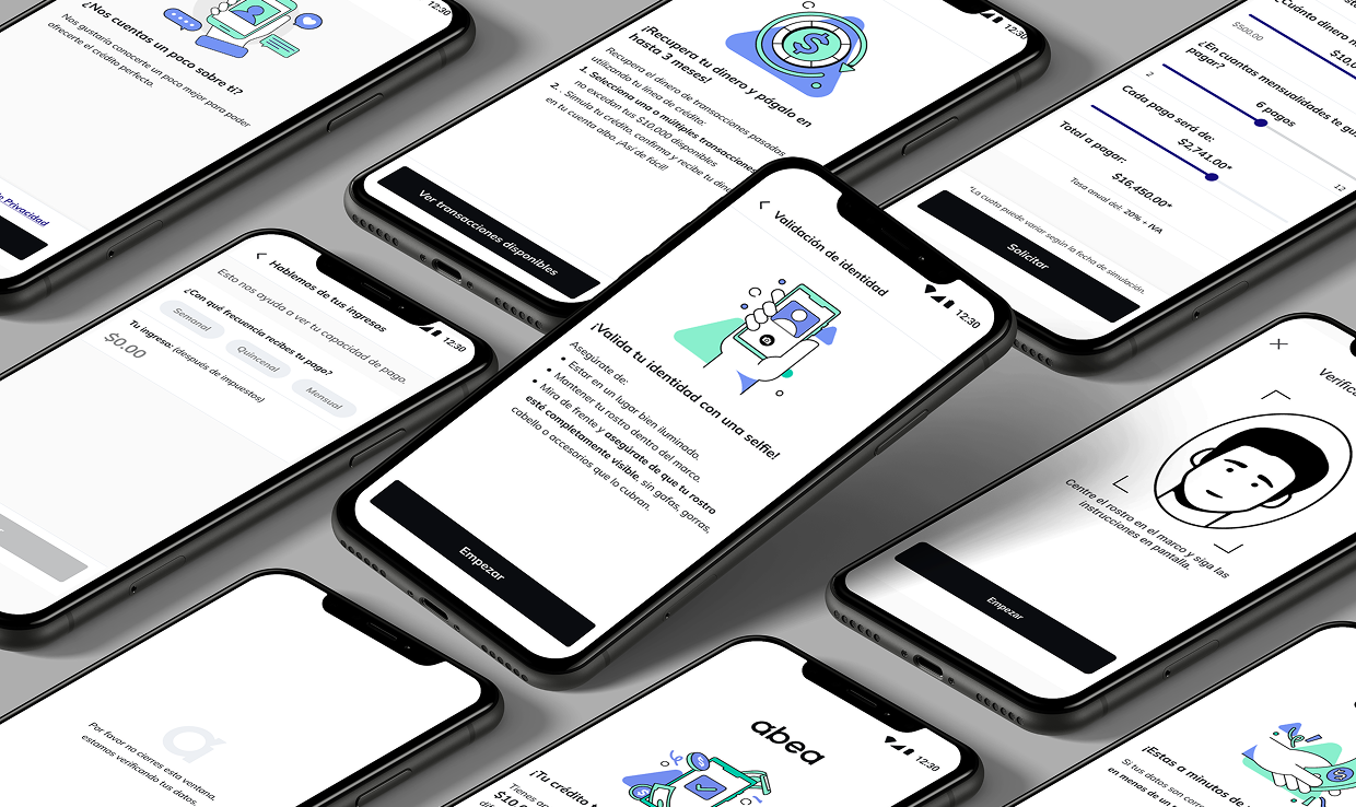
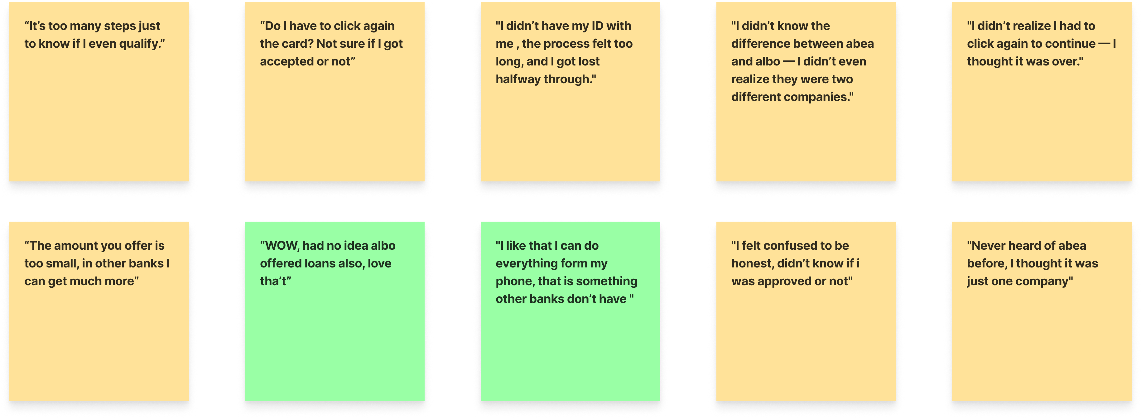
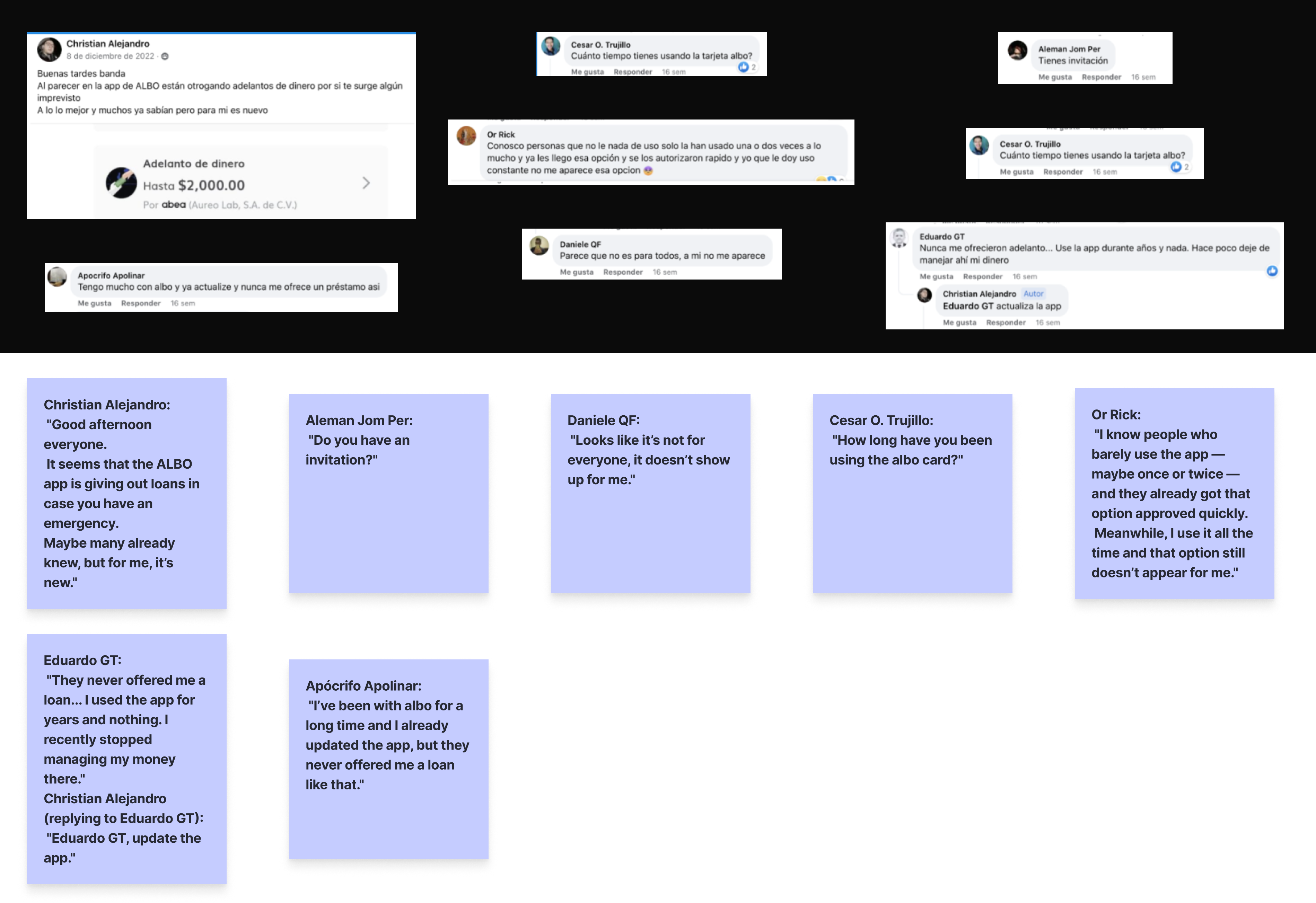
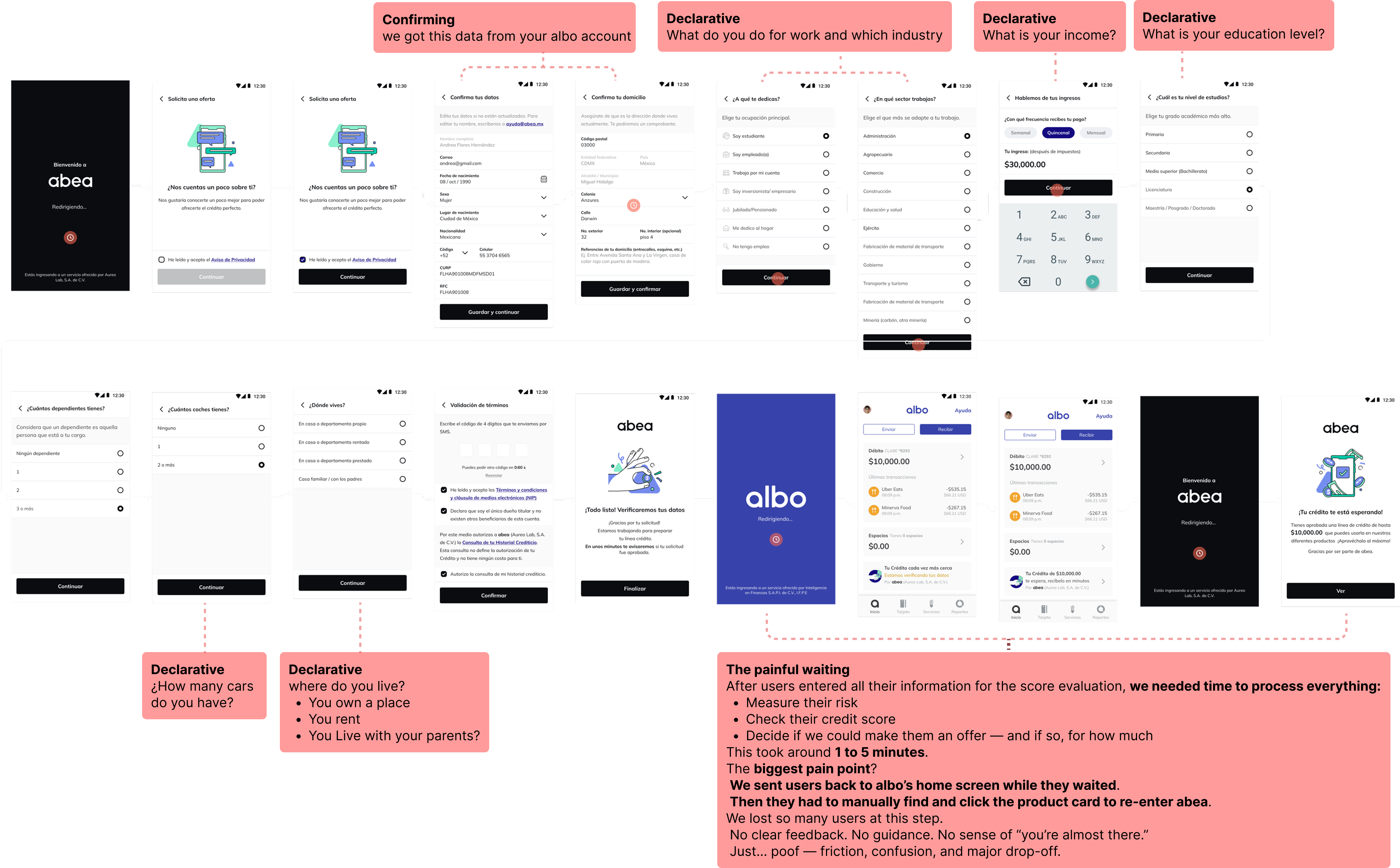
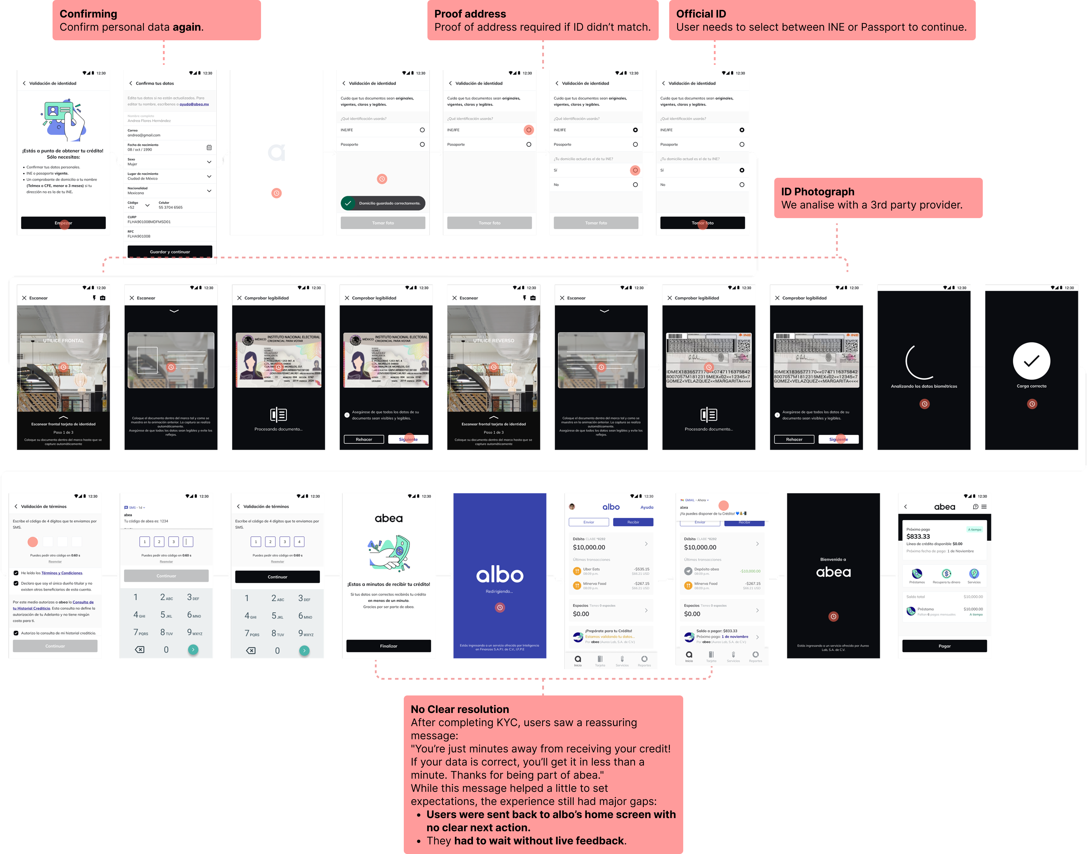
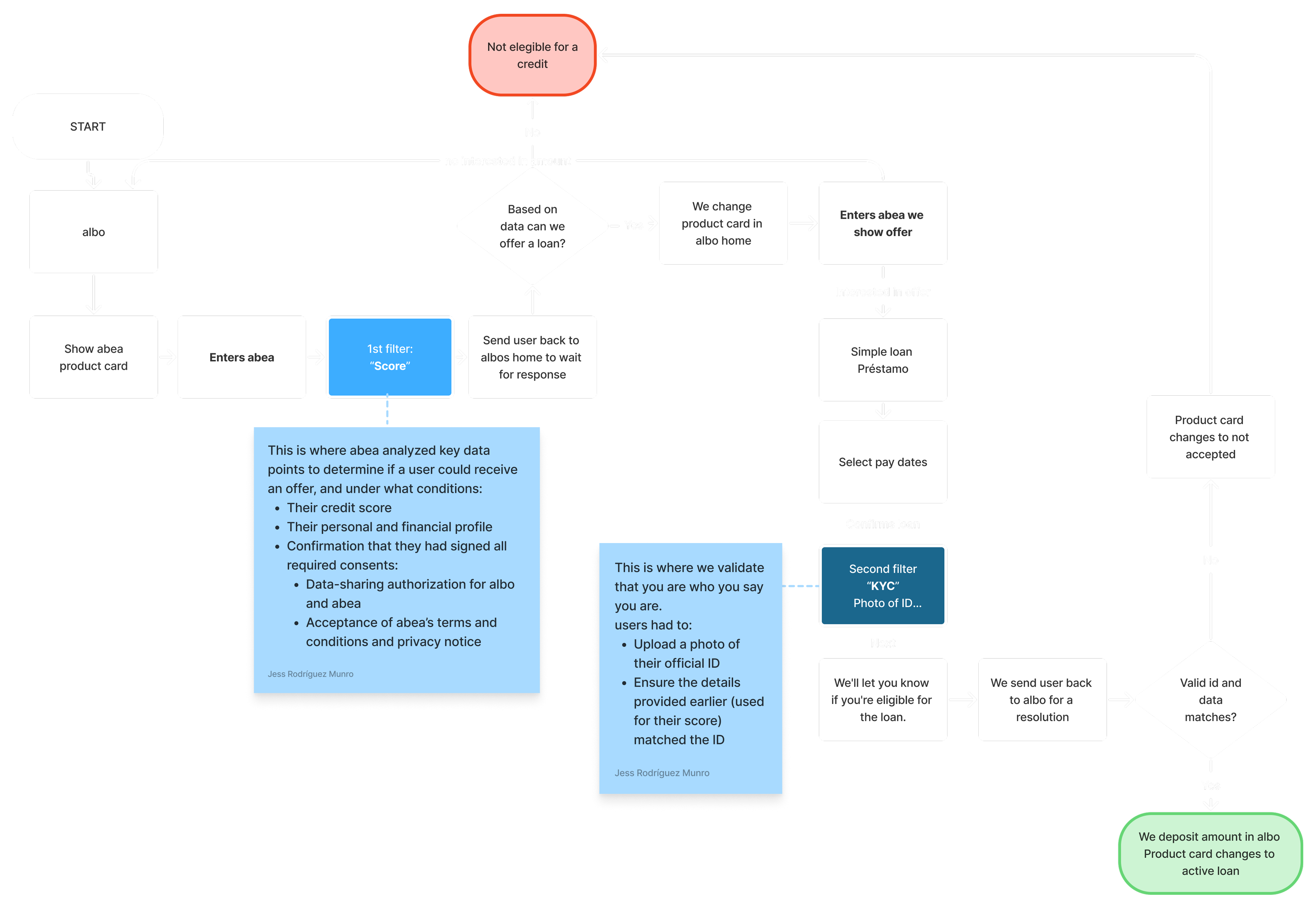
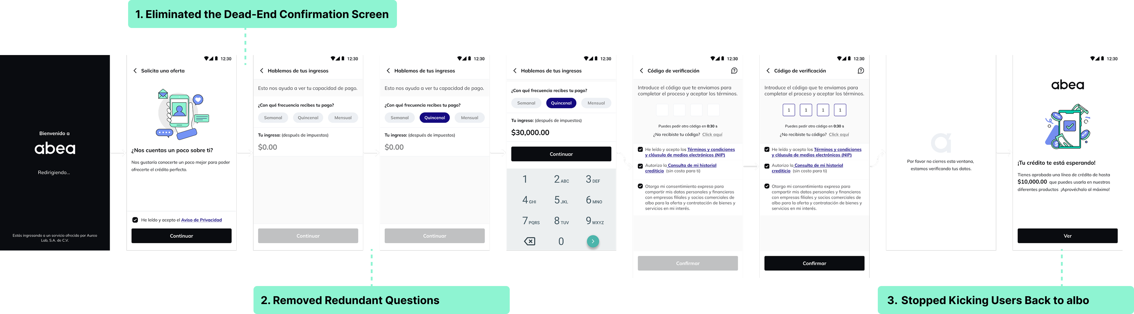
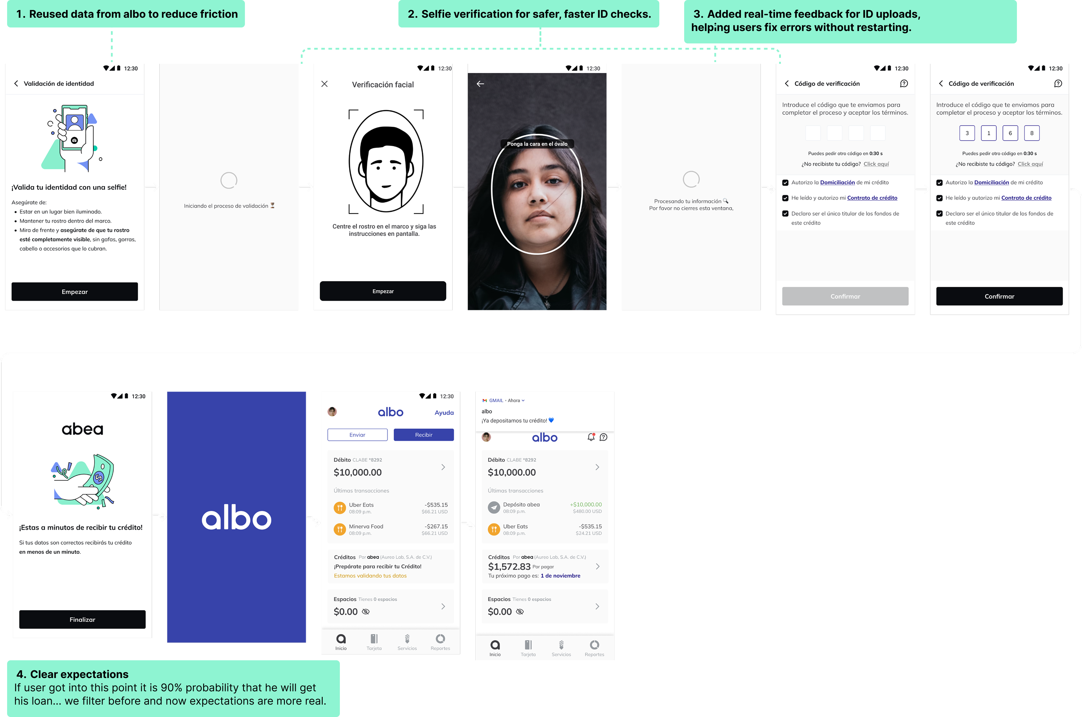
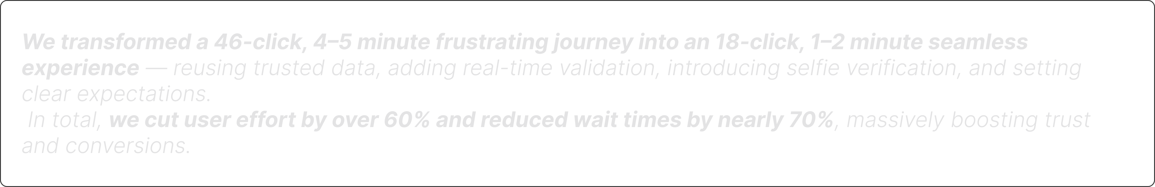
Cut a 46-click onboarding flow down to 18, boosting loan approvals and unlocking revenue growth in just 2 months.

Role

Sr. Product Designer, UX Strategy, UI, Prototyping, End-to-End Lending Flow

Team

Product Manager, Software Engineers, Risk, Compliance

Deliverables

UX Strategy, UI, Prototypes, End-to-End Lending Experience

Timeline

2 Months (2024) during Mar 2022 to Mar 2025 tenure at albo

Abea onboarding screens isometric overview

01. Overview

Fixing Onboarding to Unlock Lending Growth

At albo, a digital banking platform serving 3M+ users, lending was emerging as our biggest growth opportunity, eventually driving $267M+ in loan originations. But most users never even made it to the offer screen. The problem? Onboarding was long, confusing, and full of drop-off points. We were losing people before they could see what we had to offer.

My mission: redesign the flow to feel fast, motivating, and effortless while still meeting all legal and compliance requirements.

02. The Challenge

The Cost of Friction

Drop-off Rate

70%

Users abandoned the onboarding flow before reaching the offer screen

1

Too long

A 46-click flow packed with redundant questions

2

No feedback

After submitting, users were kicked back to the home screen with no clarity

3

Brand confusion

Users didn't understand the connection between albo and abea

03. Understanding

Let's Hear This From the Users

I interviewed 10 users, letting them walk through a prototype

Let's hear from users - user research

Overwhelmed by qualification

Users got overwhelmed just trying to see if they qualified

Brand disconnect

Many didn't realize that abea was albo's lending product

Lost in the flow

Users felt lost. No confirmation, no clear next step

Data friction

Missing IDs, typos, and outdated info caused drop-offs

User research findings and analysis

Risk Evaluation (Score)

One of the most critical and most frustrating steps. We needed user data to evaluate loan eligibility. But:

  • Friction and fatigue caused drop-offs
  • Most information was unverifiable
  • After submitting, users were sent back to the home screen
  • No feedback. No confirmation. Just confusion.
Understanding score evaluation process

KYC Verification

After users selected their loan offer, we needed to verify identity. The flow had major friction:

  • Users didn't have ID handy
  • Typos caused blocks
  • Address mismatches forced extra documents
Understanding KYC verification requirements

04. Framing the Solution

What Should We Do?

Priority 1

Make the flow shorter, clearer, and goal-driven

Priority 2

Remove hidden dead-ends and confusing wait states

Priority 3

Turn friction points into moments that built trust

This wasn't a solo effort. I partnered with Risk, Compliance, Legal, and Engineering.

Onboarding flow diagram showing partnership structure

05. Design Execution

Redesigning the First Filter: Score

1

Eliminated the Dead-End Confirmation Screen

Users were shown a confirmation step but couldn't edit anything. We removed it.

Result: One less useless step.

2

Removed Redundant Questions

The original flow overloaded users with unnecessary questions (industry, education, dependents). We cut them.

Result: Shorter flow, less fatigue.

3

Stopped Kicking Users Back to albo

Users previously waited 1-5 minutes on the homepage. We kept them in the flow.

Result: Seamless experience.

Design execution for score evaluation

Redesigning KYC Verification

1

Reused Existing Data

Secured compliance approval to reuse user data from albo.

Result: Faster onboarding.

2

Introduced Selfie Verification

Added a selfie check matching faces to ID photos.

Result: Secure, seamless verification.

3

Added Real-Time Error Feedback

Instant validation for ID photos and data.

Result: Users could fix issues immediately.

4

Set Clear Expectations

After KYC, communicated 90% probability of approval.

Result: Higher trust, stronger conversions.

Design execution for KYC verification

Transformation

Journey Reduction

46 to 18 clicks

4-5 minutes to 1-2 minutes

User Effort

60%

Reduction in effort

Wait Times

70%

Reduction in wait times

06. Final Design

Faster, clearer, and built to keep users moving forward.

Final design execution - complete onboarding flow
Final onboarding flow animation

07. Reflection

Anything Can Be a Yes If You Know How to Ask For It

This project taught me that great onboarding is about more than clean screens. It's about clarity, momentum, and trust.

The biggest takeaway? If users get lost early, you lose them forever.

Next Step

Add a Clear Progress Indicator

Show users exactly where they are in the flow to reduce friction and build confidence.

Next Step

Instant Feedback Before Leaving abea

Provide immediate confirmation and next steps upon completion instead of sending users back.

Next Step

Improve Brand Communication

Clarify the relationship between albo and abea throughout the onboarding journey.

← Back to all projects

Up next